
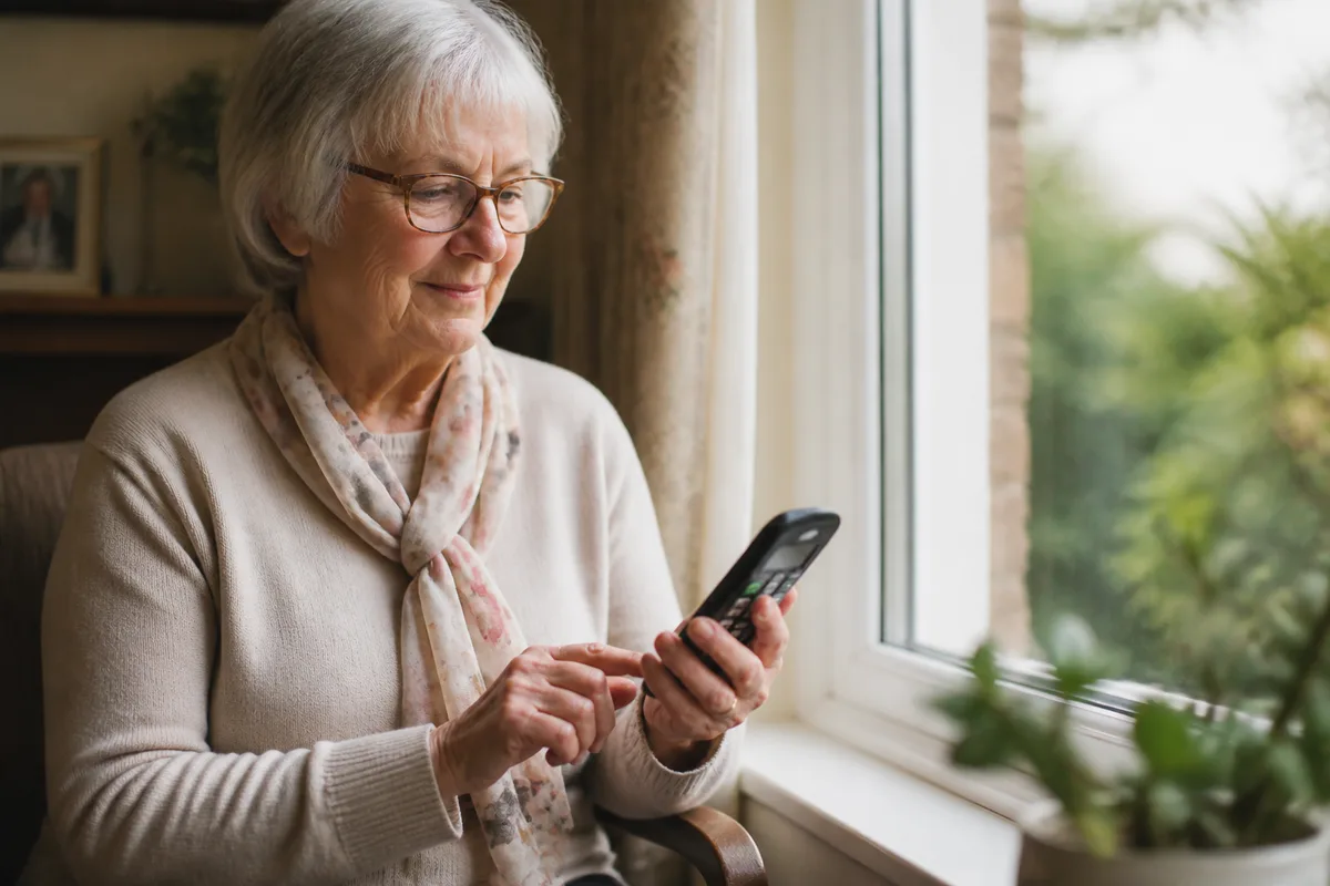
Small text, reflective screens and low-contrast icons can turn a routine call into a frustrating search. A more accessible phone setup starts by understanding what the person can see comfortably in the lighting and positions where they actually use it.
Visual impairment varies widely. Seek specialist advice where appropriate, and involve the person in every design choice.
Use contrast deliberately
Strong contrast helps important controls stand apart from the background. Black on white, white on a dark colour or another tested high-contrast combination may be clearer than pale colours on a similar shade.
Do not rely on colour alone. Combine it with position, shape, a large name or a recognisable photograph. Glossy surfaces may create glare near windows and lamps, so test the handset during the day and evening.
Simplify what must be found
Increasing font size helps only if the user can reach the right screen. Reducing navigation can be more effective. One-touch contact buttons keep the key choices visible without scrolling through a directory.
OwnFone can be personalised with high-visibility buttons, clear names or photographs for up to 12 contacts. The chosen layout is prepared before delivery. Learn more about the OwnFone handset or build a personalised design.
Make location predictable
An accessible phone is not useful if it cannot be found. Give it a consistent home: perhaps a bright tray beside a favourite chair or a charging position with a contrasting mat. Use the supplied lanyard if wearing the handset is comfortable and appropriate.
Keep the charging cable route tidy and easy to identify. Good task lighting can help, but avoid placing the phone where the light creates reflections.
Check sound and touch too
People rarely rely on one sense alone. A physical button, a clear sound and a familiar position can reinforce the visual cue. Ask whether the person can feel the spaces between buttons and recognise when a press has registered.
Review the design together
Print or display several possible names, photographs and colour combinations before finalising the phone. Ask the user to identify them at a comfortable distance. A family member’s favourite photograph may not be the clearest one.
Good accessibility is specific. The best layout is the one the individual can recognise quickly, in their own home, without having to remember a workaround.